Mapping millions of vehicle positions
Inspired by Mapbox’s map of 6 billion tweets, I decided to try and create some maps of my own using the GPS data from my vehicle tracking system.
As the tracked vehicles drive around, they emit messages every few seconds that report their current speed and location. I took the last few months worth of messages, 22 million in total, and visualised each one as a green dot.
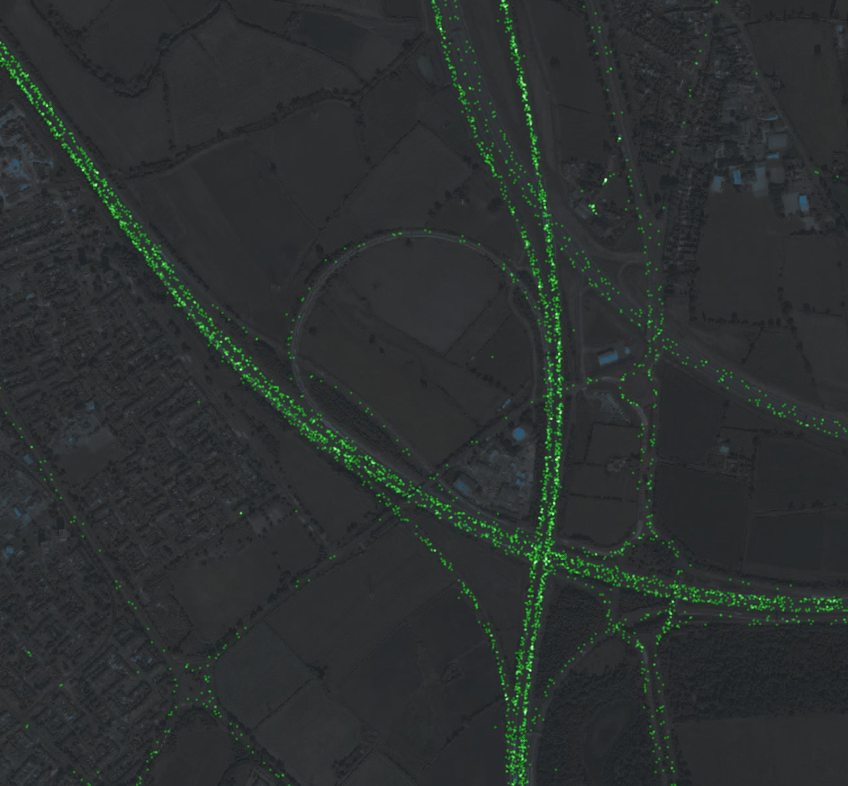
Zooming out, the messages overlay each other and form clear white lines along the most travelled routes.
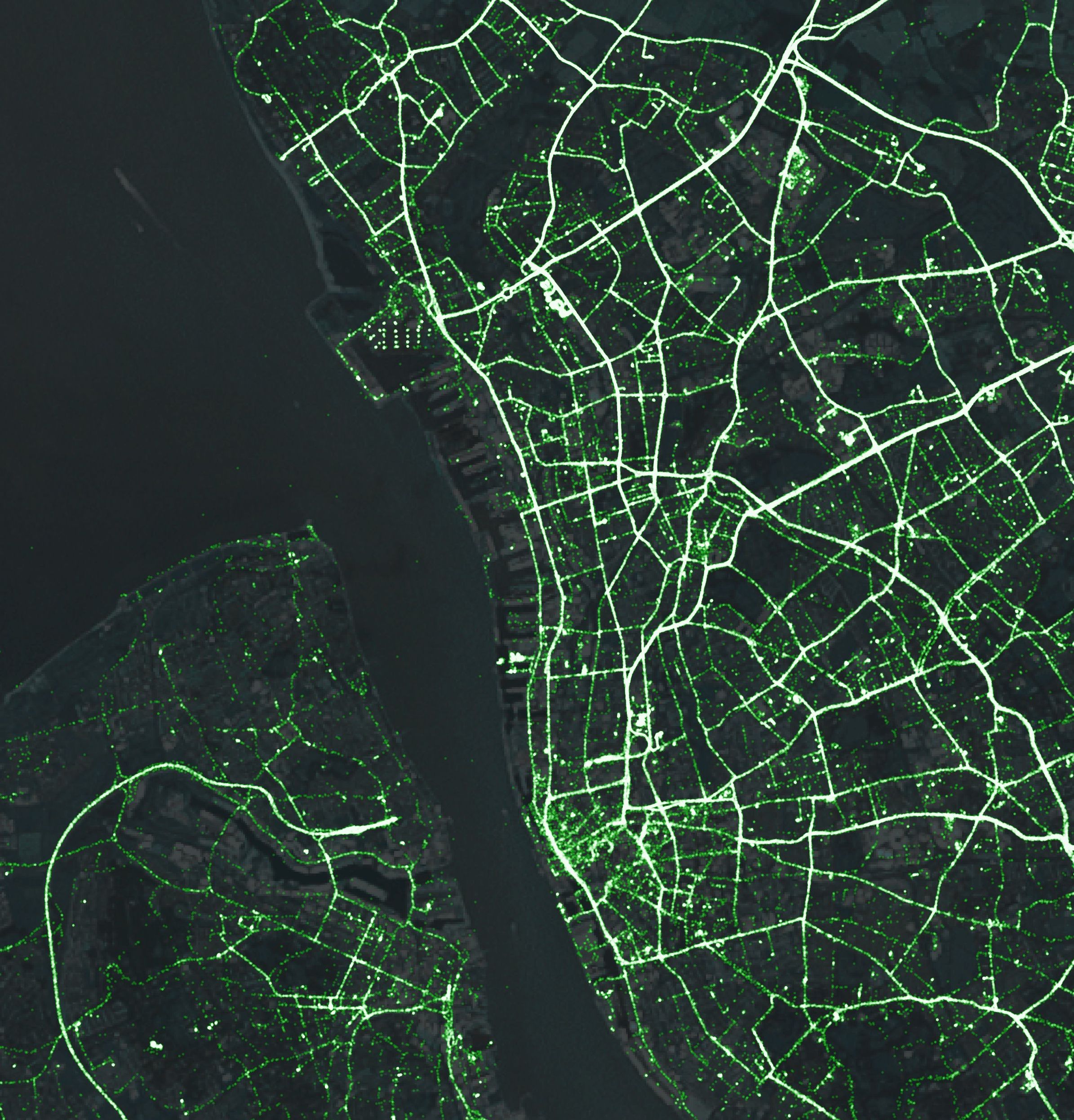
Which, when viewed at small scales, really show the veins and arteries of the road network.
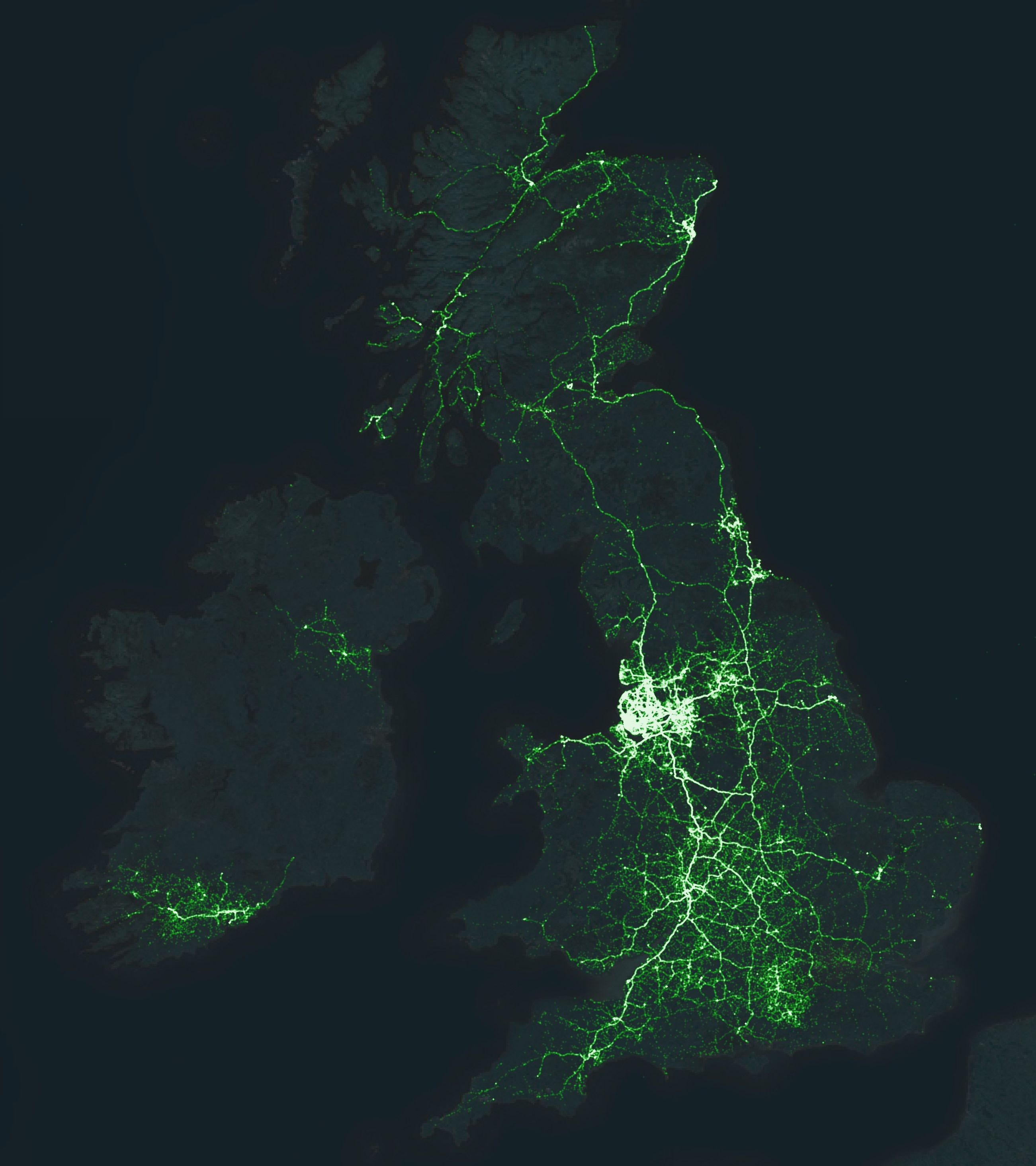
I made these maps by crunching the raw data into vector tiles using tippecanoe and then I styled the data using Mapbox studio. It’s basically thanks all round to Mapbox as the satellite imagery is theirs too.